Work About Contact

The future is you(th)

We know how important it is to live in the moment, but also to build a better future. That's why Fast App was created: a financial app that helps young people save effortlessly and stress-free.
Client
Fast
Category
Banking
Device
App
Time
1 month
Country
UK
Role
Product designer
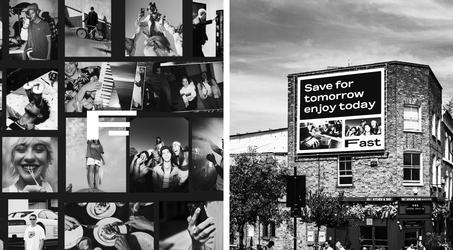
Fast, youth culture photo collage with 'Save for tomorrow enjoy today' billboard

No bank energy.

Fast doesn't try to upsell you, educate you, or remind you that you should probably be saving more. It just sets up your jars, moves your money quietly in the background, and gets out of the way. The same way your favorite brands become a way of living, Fast doesn't feel like a bank.
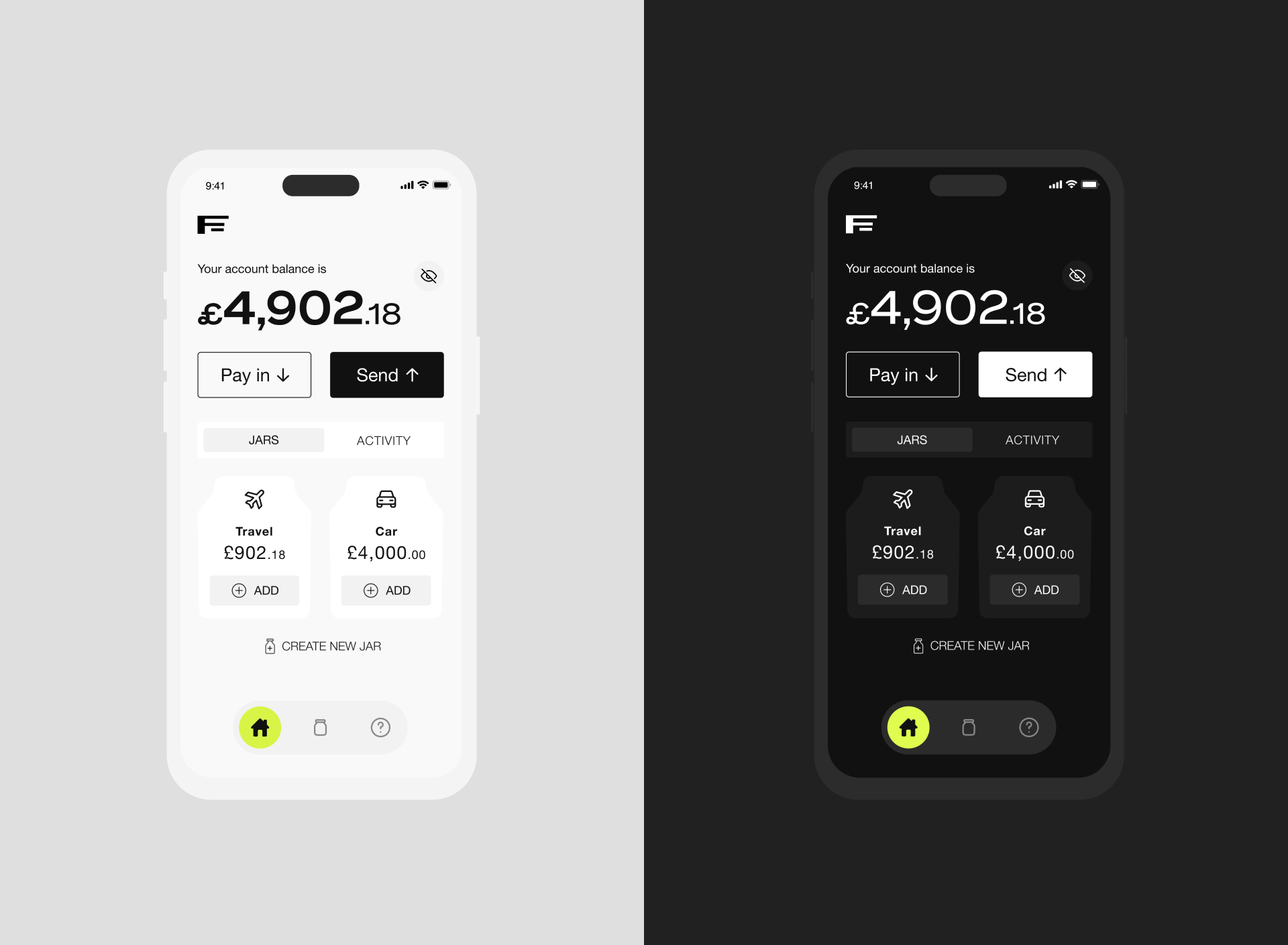
Fast, light and dark mode account balance screens

The need

Most banking apps are built by institutions that then try to feel young. Fast was an opportunity to do the opposite: start with the audience and build everything around them. Young people are used to products that reflect their taste, speak their language, and adapt to their habits. Their bank had never done any of that.

The solution

To connect with its audience, the app embraces two key design elements: urban and gritty imagery that captures youth culture, and a clean black-and-white aesthetic, elevated by customizable accent colors for a personal touch.
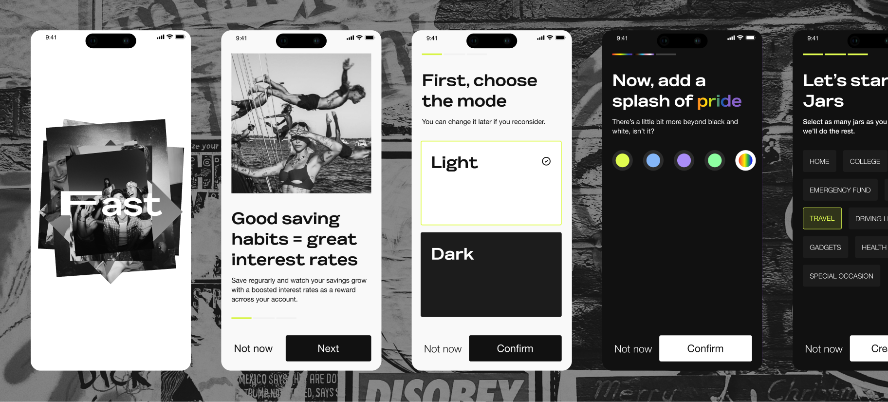
Fast, five app screens over urban photo background: Fast logo, saving habits, choose mode, accent color, jars
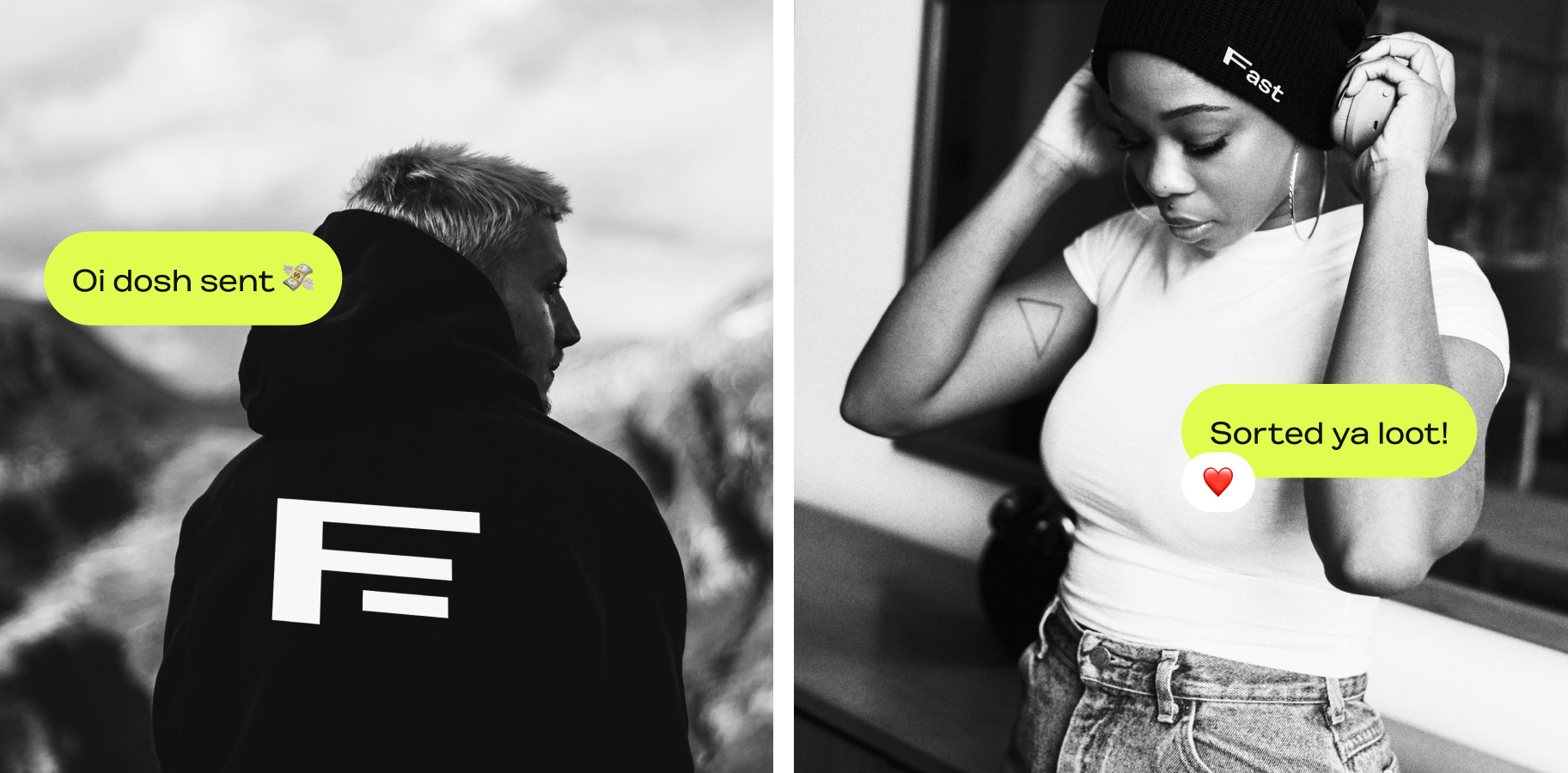
Fast, hoodie portrait with 'Oi dosh sent' and beanie portrait with 'Sorted ya loot' speech bubbles
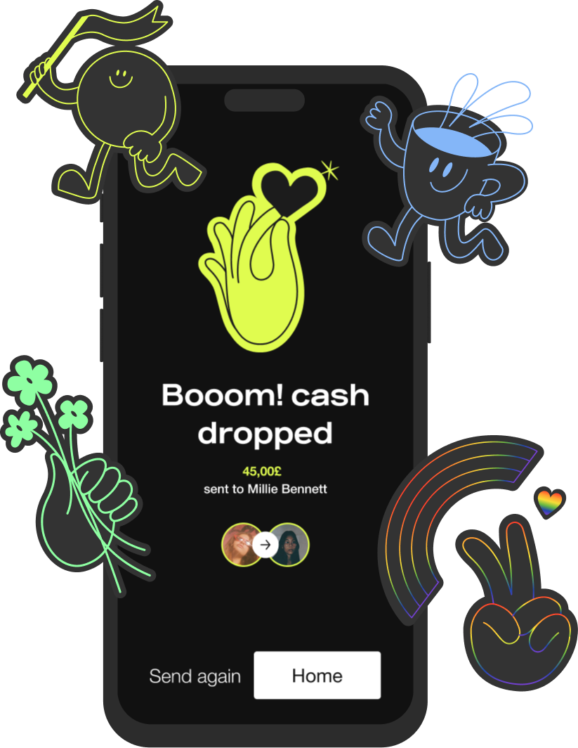
Fast, phone showing 'Booom! cash dropped' surrounded by neon character stickers

The process

Every screen you'll see started as a question. We sketched, tested and refined until Fast felt right for the people it's built for.

UI exploration
Visual proposal
MVP design screens
Libraries & documentation

Key decisions

Personalisation before onboarding
Most apps ask you to log in before letting you shape anything. Fast flips it: you pick mode and accent before account setup, so the very first interaction is creative, not bureaucratic. It set the tone for the rest of the product.
A bank that speaks slang on purpose
"Oi dosh sent" and "Sorted ya loot" are decisions, not jokes. Committing to UK Gen Z vernacular in every micro-copy moment scoped out a clear audience and freed the rest of the UI to be quiet and clean, the language carries the personality so the screens don't have to.
Goal-shaped saving instead of generic balance
Jars turn a balance into a story: festival, gear, first car. People save more for things they can picture than for an abstract pot. Pairing jars with streak-based interest boosts made the maths and the motivation point in the same direction.
Aesthetic as strategy, not decoration
Neon characters, gritty street photography, "Booom! cash dropped", these are aesthetic choices the leadership team didn't love at first. Holding the line on a confident, slightly chaotic visual language was what kept Fast from looking like every other fintech rebrand.