Learning by investing
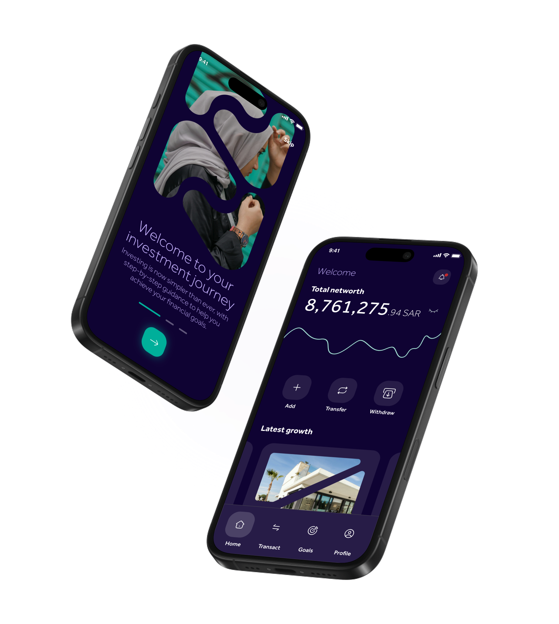
Nami is a robo‑advisor app built for first‑time investors in the UAE. It's a place where investing feels easy, intuitive, and a little less intimidating. The app guides users through the basics, learning as they go, so they can make confident decisions and take real ownership of their financial future.
Set, Save, Grow
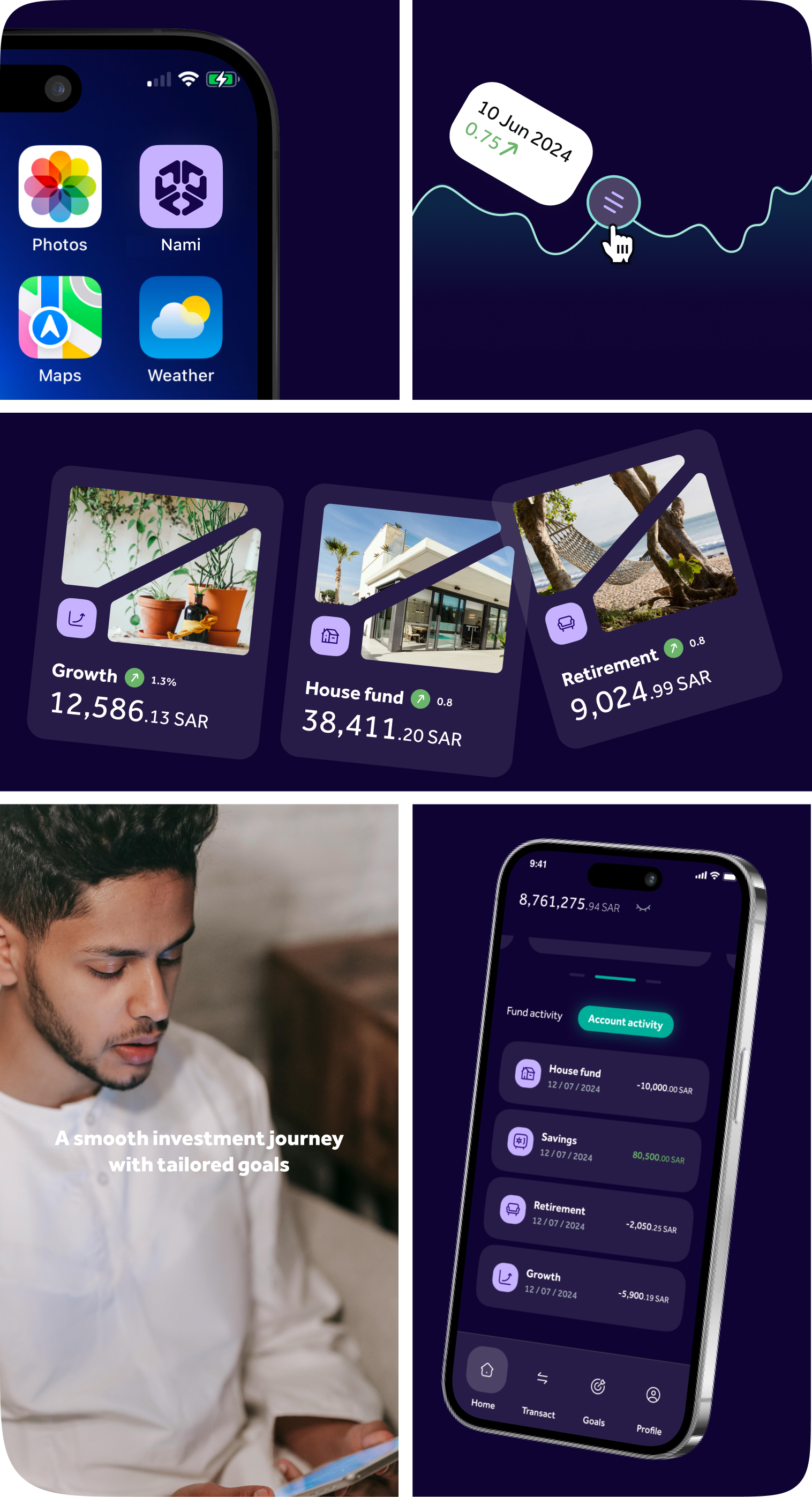
With a seamless onboarding process, users set up savings goals tied to real life milestones: a home, retirement or an emergency cushion. From there, the app works quietly in the background: automating contributions, tracking growth, and surfacing insights at the right moment.
Users don't need to know about markets to start. They just need a goal.
The need
In 2024 only around 20% of UAE consumers bought any financial investment products beyond pension funds, while 65% said they want to improve their knowledge of savings and investments. Nami needed an efficient, accessible, and transparent Robo‑Advisor app targeting a wide range of new investors. Putting the focus on financial education, personalization, and a fresh look and feel.
The solution
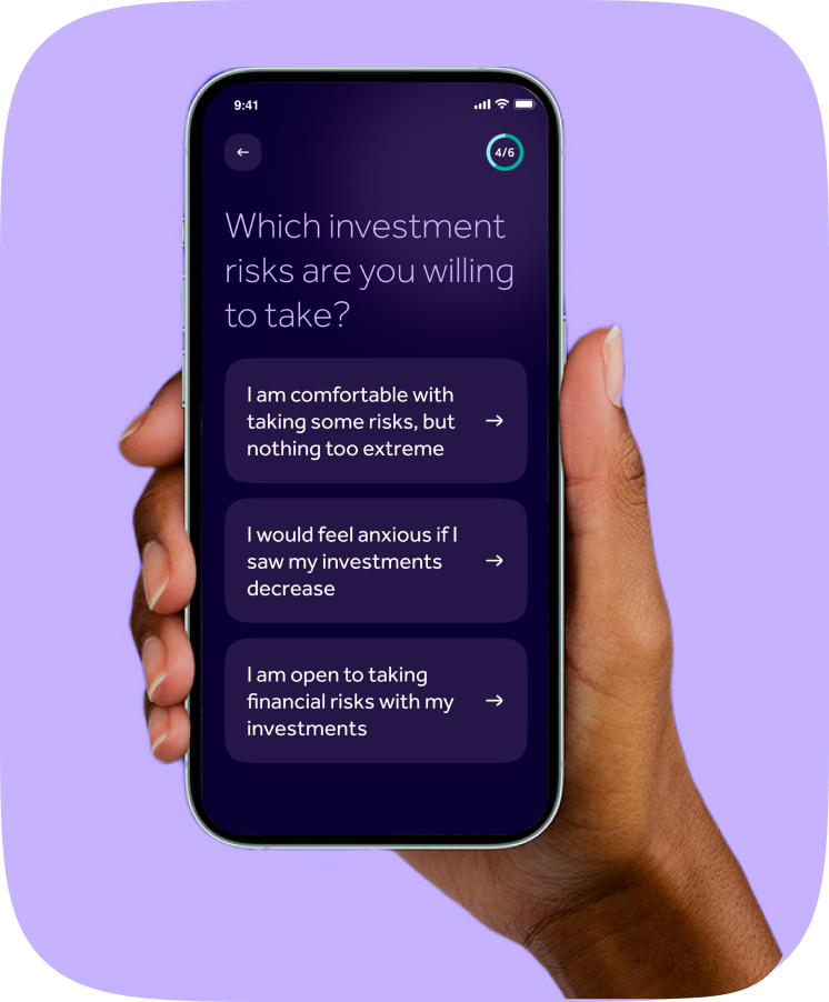
We designed a user‑friendly experience with clear, personalized guidance for first‑time users. Blending educational tools and simple financial insights that are easy to understand, making investment easy for everyone.
The process
Research, structure and craft, in that order. Every insight from early interviews fed directly into the decisions that shaped a beginner-friendly product.
Key decisions
Related projects




 Coming soon