Work About Contact

Lively ease banking

Sana means brilliance in Arabic. That's why we built a bright, simple, human banking experience that makes money clear, actions effortless, and support genuinely caring, so every financial decision feels more human.
Client
Sana
Category
Banking
Device
App
Time
3 months
Country
Saudi Arabia
Role
Design Lead
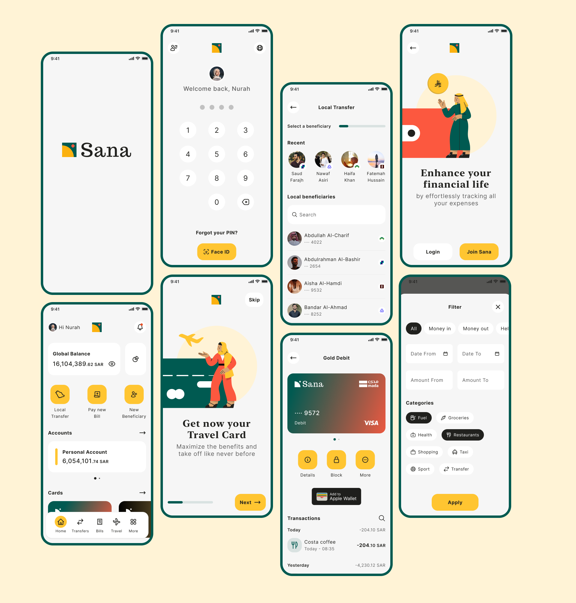
Sana, app screens collage on cream background

Finance made bright, simple and human

Sana redefines how users interact with their money, demonstrating that financial services can be genuinely insightful, remarkably straightforward, and deeply personal.
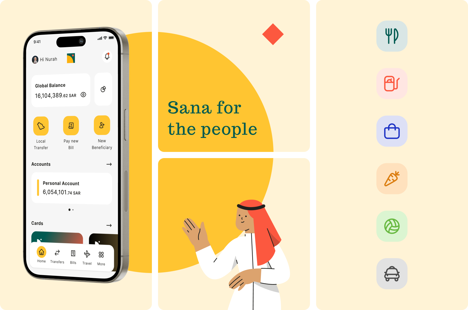
Sana, dashboard phone, 'Sana for the people' illustration, and category icons

The need

Today's banking often feels complex, impersonal, and opaque. Customers need clarity, ease, and genuine care to confidently manage their finances. This unmet demand for a truly bright, simple, and human experience is what Sana was created to fulfil.
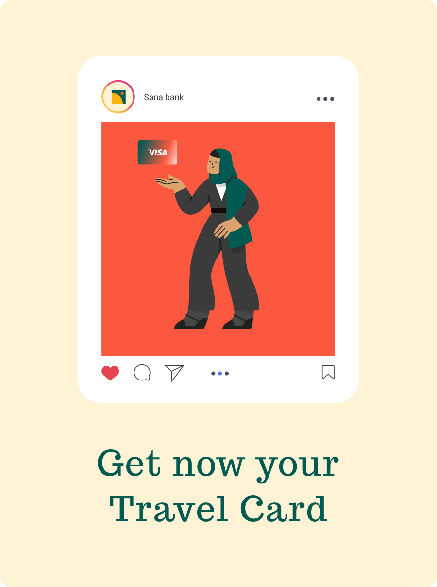
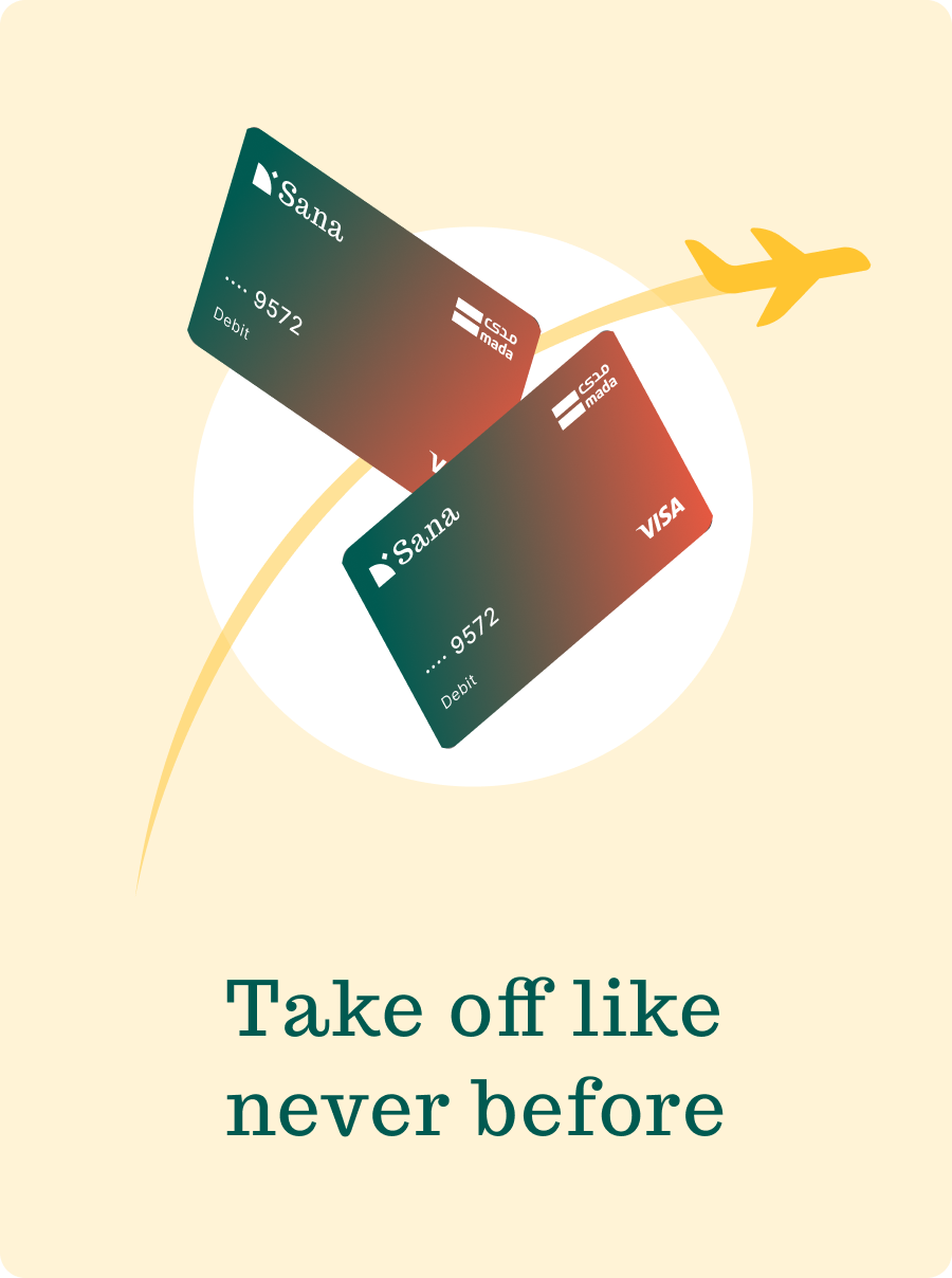
Sana bank social card, Get now your Travel Card
Travel cards illustration, Take off like never before

The solution

We illuminate financial choices with transparent language and intuitive tools, simplify processes for effortless management, and humanize interactions with genuine care and support. This approach transforms banking into a clear, easy, and empathetic journey.

The process

We listened before we designed. Interviews and research shaped the direction, and each round of testing brought Sana closer to a bright, easy, human way to bank.

Client interviews
UX benchmark
User personas
Empathy maps
Jobs to be done
Visual proposal
Libraries & documentation

Key decisions

Designing for clarity over completeness
Banking apps tend to surface every option at once. We chose to show fewer things at a time and trust the user to ask for more. The hardest design conversations were about what to remove, and those decisions are what make Sana feel bright instead of busy.
Language as part of the product
Financial terminology is where most banks lose people. Rewriting labels, empty states and confirmations in plain, warm language did more for comprehension than any UI change. Tone became a deliverable, not an afterthought.
A single visual system across products
Sana spans day‑to‑day banking, cards and travel. Committing early to one type scale, one colour system and one illustration style kept the family coherent as new products were added, and made the design team faster, not slower.
Illustration to carry the human side
Photography felt corporate and screenshots felt cold. Custom illustration became the way to show real people and real moments without staging them, and it gave the brand a voice that scales from a social post to an onboarding screen.